This project was meant to discover/visualize letterform features and the many different spaces they occupy. With this project, we needed to understand typeface characteristics and the terminology. We were challenged to create a compelling graphic composition using typeface features. The different typefaces that we were given to use were:
Fette fraktur lt standard regular
Stempel garamond lt std roman
Bauer bodoni std 1 roman
Rockwell std regular
Futura std medium
Helvetica lt std roman
Platelet

Above is the final design that I chose for my project. (Below) are different typefaces that I tried out to create different designs.


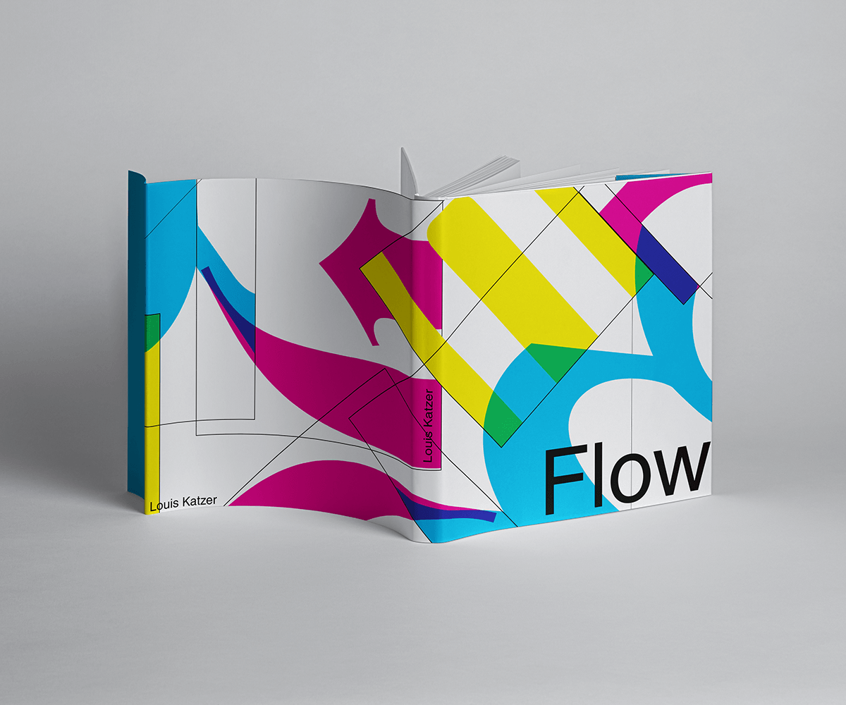
Here is a mockup of a book with my design on it. I tried to cover the whole book to created a unique design. Along with the design, I added "Flow" which is what I called my design. The meaning behind flow is for how my piece flows down the page.

Above is a mockup of soda cans. I chose this mockup because I thought it was be interesting to see how my design was on a product that normally doesn't have an outgoing design on.
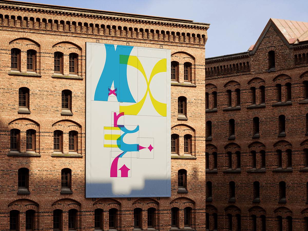
Above is a composition of Tasty Bits on a mockup of a poster on the side of a building.

